Pop-Up Retail Design: How to Display Products That Actually Sell
What Is Pop-Up Retail Design, and Why It Determines Conversion
Pop-up retail design is the deliberate arrangement of space, fixtures, signage, lighting, and checkout flow in a temporary retail setting to move shoppers from browsing to buying.
Done well, it becomes one of your highest-leverage decisions as a maker. Done poorly, overcrowded table, handwritten prices no one can read, a payment process that requires four steps, you'll watch shoppers pick things up, put them down, and walk away. Your display arrangement is not decoration. It is your sales team.
The core principles are straightforward: guide where shoppers look first, remove every moment of hesitation, and make the price and the path to purchase obvious from a metre away. Each section that follows handles one of those principles in order. If you're still figuring out what a pop-up retail presence actually costs before committing to design investment, start there, then return here.
The mechanics ahead, layout, fixtures, signage, lighting, checkout, and setup timeline, follow the order you'll actually need them.
Layout and Flow: How Shoppers Move Through Your Space
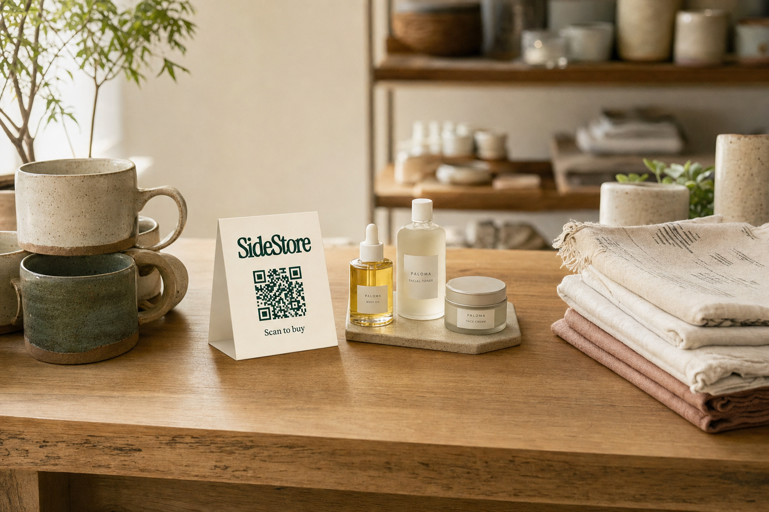
Place your highest-attention items at eye level, roughly 90, 150 cm from the floor, in the first zone a shopper reaches after the decompression zone, not on the table edge closest to the aisle.
Every display has a decompression zone: the first 60, 90 cm of space a shopper enters after stopping at your stall. Shoppers are still orienting themselves there. They scan, not touch. Anything you place in that first stretch, a sign, your best product, a stack of business cards, will be largely ignored. Step past it. That's where your mid-range products belong, not your hero pieces.
Research on shopper movement in retail environments consistently shows a right-turn tendency. When a shopper approaches a rectangular display table, they tend to drift right. Put your most picked-up product in that right-hand position, within natural arm reach.
Avoid the dump display: a dense cluster of products at the same height with no breathing room. Shoppers treat it as background noise. Instead, apply the three-zone rule to any single table:
- Zone 1 (front-right): Hero product or best-seller, elevated on a riser or stand, with clear space around it.
- Zone 2 (centre-back): Supporting range at 10, 15 cm lower height, grouped by colour or type.
- Zone 3 (front-left): Low-commitment entry products, priced to encourage impulse buying.
Leave at least 30% of your table surface visually empty. It signals quality and makes each item easier to examine. Choosing a pop-up retail space will also affect how much room you have to work with, so factor your table footprint into that decision early.
Fixtures and Surfaces: What to Use and Why It Matters
The fixtures that improve conversion are the ones that put products at the right height, in the right material context, without costing more than the margin they generate.
Here are the five main fixture types with honest trade-offs:
Folding trestle table, the default choice for most makers. Lightweight, cheap, and widely available. The problem is height: a standard trestle sits at roughly 75 cm, which puts small products below comfortable browsing height. Raise it with table risers or stack crates underneath your display cloth. Works across almost every product category.
Pop-up retail cart, a wheeled display unit, often used in mall corridors or indoor markets. A cart gives you a contained, professional footprint and handles products that benefit from vertical display: clothing, accessories, packaged food. The trade-off is cost and transport. A cart makes sense if you do five or more events per year in the same format.
Grid wall panels, vertical wire grid that stands behind or beside your table. Excellent for jewellery, small bags, or anything that benefits from hanging at eye level. Pairs well with a trestle. Bulkier to transport than it looks.
Wooden crates and risers, low cost, high visual warmth. The material matches handmade ceramics, textiles, and skincare products particularly well. Less suited to precision tech or minimal-aesthetic brands.
Acrylic display stands, clean, invisible, and ideal for products where the object itself should do the talking: art prints, glassware, candles. Easy to transport, easy to break. Bring spares.
The decision rule: match fixture material to product story. Rustic wood signals craft. Acrylic signals precision. A pop-up retail cart signals permanence and volume. Pick the one that makes your product look like it belongs there. For guidance on product-specific presentation, see presenting handmade jewellery for retail buyers for a worked example of fixture-to-product matching.
Signage and Pricing Display: Make It Readable at a Glance
The signage and pricing decisions that most affect conversion are legibility at distance, price visibility within three seconds, and the absence of clutter that makes shoppers work to find information.
Signage serves three functions at a pop-up: identification (who are you?), orientation (what do you make?), and conversion (what does it cost and why is it worth it?). Most makers only do the first one.
The three-second price rule: if a shopper can't read the price of an item within three seconds of stopping at your display, you'll lose the sale. They won't ask. They'll move on. Price tags should use a minimum font size of 18pt for print, in a high-contrast pairing, black on white, or white on dark background. No script fonts on price tags. Legibility beats aesthetics here.
Your brand sign should sit at 150, 170 cm height, visible from at least three metres away. Use a minimum font size of 36pt for the display name. Keep it to four words or fewer.
At crowded events, apply the simplicity principle: one sign, one price per product, one sentence of product description if any. Every additional piece of text competes for the shopper's attention and typically loses. A laminated card with the product name and price on a single line outperforms a paragraph of story copy at a busy market.
For product descriptions that must be longer than one line, a material provenance note, a care instruction, use a QR code linking to a product page rather than printing it on your signage. This keeps the display clean while giving interested shoppers a path to more detail.
Before your next event, review your pitching your products to local retailers strategy alongside your signage approach, the way you describe your products verbally should match what is written on the display.
Lighting and Atmosphere: The Variable Most Makers Skip
Yes, lighting at a pop-up affects sales. Flat venue lighting makes products look flat, and flat products sell less. A targeted light source that makes your display stand out from the stall next door will draw more initial stops.
Venue lighting, fluorescent overheads at indoor markets, flat daylight under a gazebo, is typically designed for the venue, not for your product. It will flatten texture, dull colour, and make your display look like everyone else's. This is fixable at low cost.
The minimum viable lighting setup for an indoor pop-up is two clip-on LED spotlights aimed at your product zone, positioned above and slightly in front of the display rather than directly overhead. Warm white (around 3000K) works well for food, textiles, and ceramics; neutral white (4000K) is better for print work, jewellery, or anything with fine detail. A basic two-light setup typically costs under £40 for clip-on units from general hardware or home stores, though prices vary.
Outdoors in direct sun, lighting is less urgent. Shade becomes the priority: a white or light-coloured gazebo top reflects natural light evenly across your display, whereas a dark-coloured cover creates shadows. Position your display to catch ambient light, not direct sun that causes glare.
Optional atmosphere levers, a small branded candle if your product range suits it, a folded textile sample that shows product in use, a single potted plant, can extend the visual identity of the display without adding significant cost or weight. For display in specific environments, displaying art prints in a cafe setting covers venue-specific lighting decisions in more detail.
Checkout and Payment: Remove Every Moment of Hesitation
The checkout setup that minimises drop-off at a pop-up is one where the path from decision to payment is visible, immediate, and requires no explanation.
Three checkout failure points cause the most abandoned sales:
- The card machine hunt. Shoppers watch you search for your payment device and lose confidence. Keep it on the table surface, powered, and within arm's reach at all times.
- The cash-only moment. If you only accept cash and the shopper has none, the sale is gone. Dual payment options, card and a scan-to-pay method, cover most scenarios.
- The price recalculation pause. If you have to work out a total, the shopper has a moment to change their mind. Pre-set prices with no negotiation, and make a clear total-display habit.
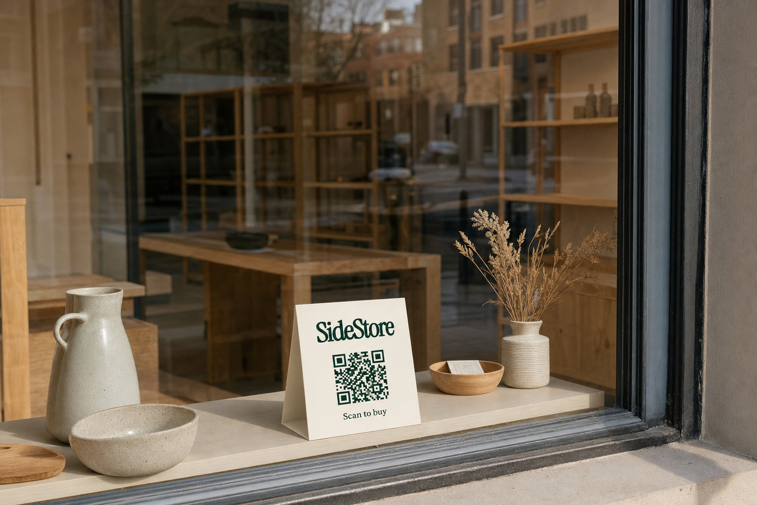
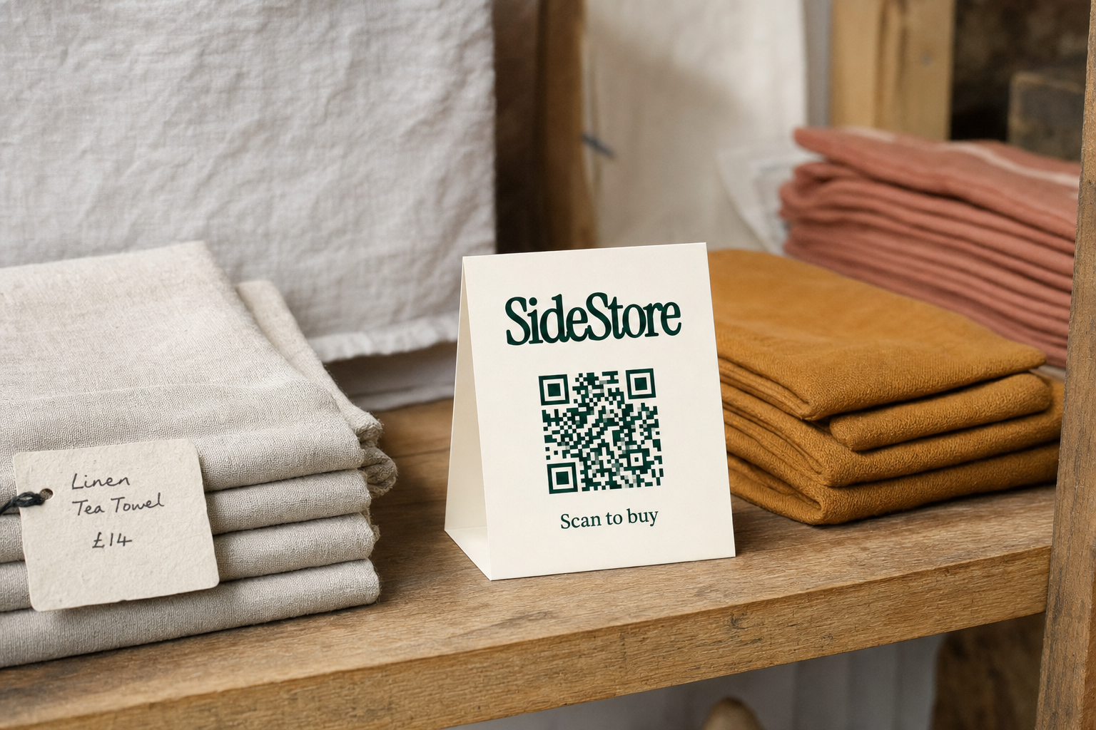
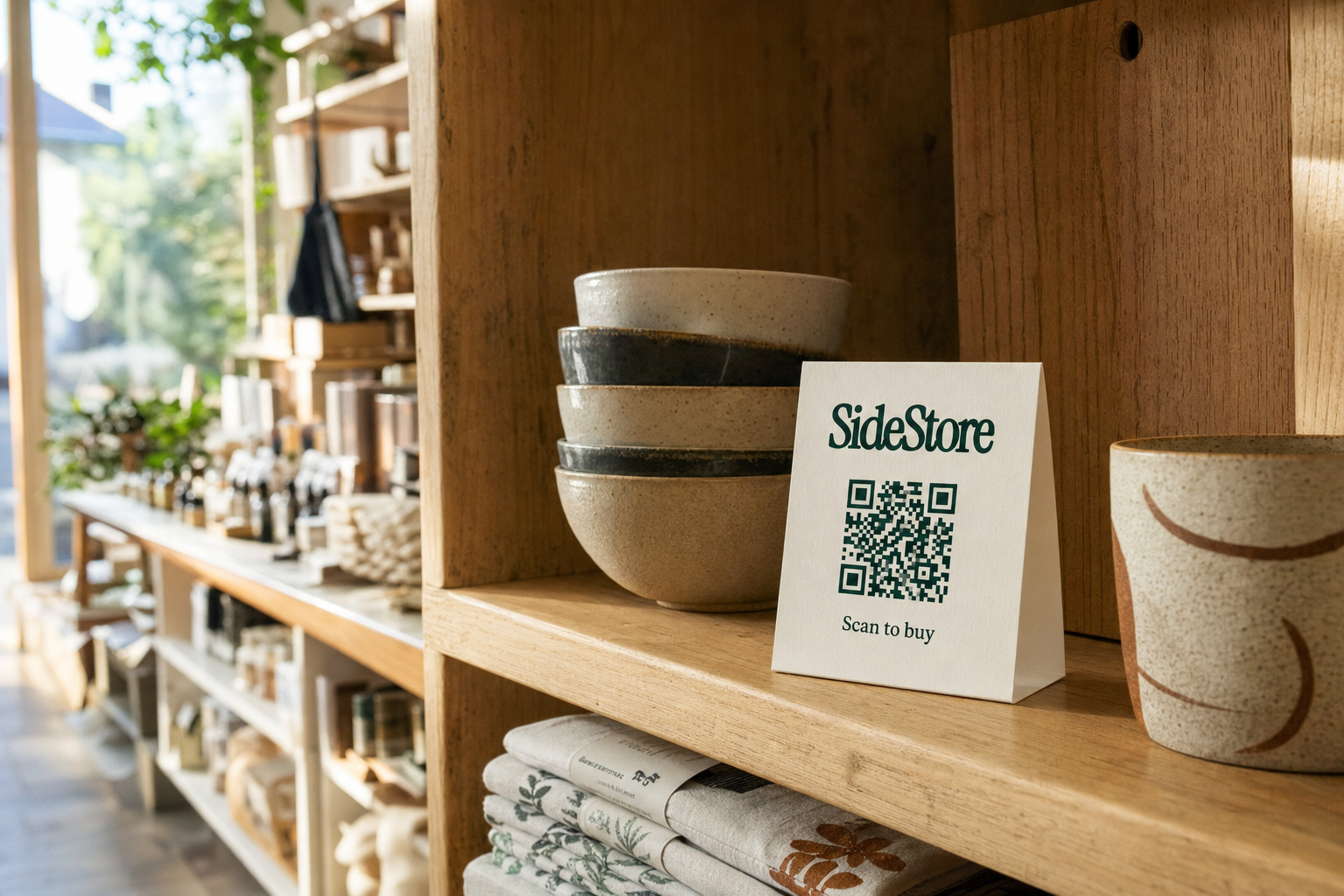
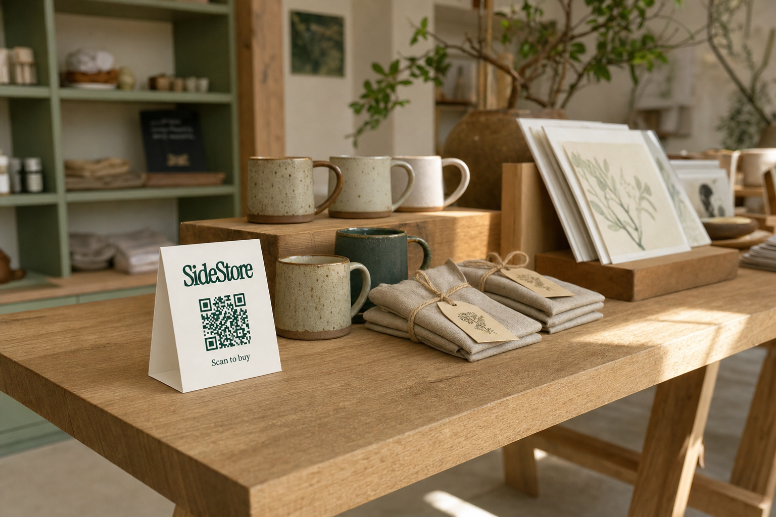
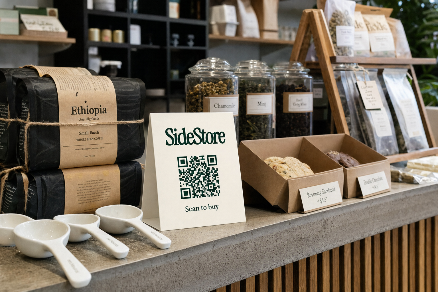
The most effective friction-removal tool for multi-product or multi-location makers is a printable scan-to-pay QR card. A shopper picks up a product, scans a QR code, and pays from their phone without you needing to intervene. This is one function of the SideStore Retail Widget, the broader interface that handles live stock tracking, placement attribution, and automatic split payouts between maker and host, not just checkout.
What makes this particularly useful at a pop-up is that the same system transfers directly to permanent consignment placements. Once you have used the Retail Widget to run checkout at a pop-up, you can deploy the same setup into a boutique, cafe, or hotel shelf with no additional configuration. The QR card can be attached to individual products by the maker, or a merchant can display a single card for all the products in their placement.
For the mechanics of managing stock across multiple locations, see managing consignment inventory across multiple locations. And for how the consignment model actually works from the seller side, selling through someone else's space on consignment covers the fundamentals.
Pop-Up Display Setup: Phases, Timelines, and What to Check
Set up in the right order and your display is ready to sell from the moment the first shopper arrives. The correct sequence is: space and surface first, then fixtures, then product placement, then signage, then lighting, then payment.
| Phase | Task | Timeline | Owner | Success Metric |
|---|---|---|---|---|
| 1. Space prep | Measure and map footprint; confirm power access and table position | 2, 3 days before | Maker | Footprint confirmed, power source identified |
| 2. Fixture assembly | Assemble and test all stands, risers, grid panels, or cart | Day before or morning of | Maker | All fixtures stable and at correct height |
| 3. Product placement | Arrange products by zone (hero / supporting / entry), apply three-zone rule | 45, 60 min before open | Maker | No overcrowding; hero item visible from 2 m |
| 4. Signage | Position brand sign at height; confirm all price tags readable at arm's length | 30 min before open | Maker | Brand name readable from 3 m; every item priced |
| 5. Lighting | Clip and aim spotlights; test on actual product surfaces | 20 min before open | Maker | No flat zones; hero product visibly highlighted |
| 6. Payment | Power card machine; set up QR card and test scan-to-pay flow | 15 min before open | Maker | Full test transaction completed; QR confirmed live |
After the event, run a brief review before you pack down. Note which products were picked up most, which stayed untouched, and what questions shoppers asked most frequently. These three data points, pick-up rate, dead zones, and verbal enquiries, are the basis for deciding whether a venue is worth approaching as a permanent consignment partner. For cost benchmarking on future events, see what pop-up retail space typically costs.
Retail Pop-Up Events: Choosing the Right Venue and Format
The retail pop-up event formats that give makers the best return on display investment are those where the audience matches the product and the venue host has a genuine interest in the outcome.
Four common formats, with honest trade-offs:
Curated indoor markets, juried or invitation-only events in venues like warehouses, galleries, or civic spaces. High footfall, high-quality shopper, higher entry cost. Best return for makers with mid-to-high price points and a coherent visual brand.
Makers' markets and craft fairs, accessible, low-cost entry, and a shopper who expects handmade products. The competition density is high, which makes display quality even more important. Best for testing new products and price points.
Host-venue pop-ups, a retailer, cafe, or boutique gives you a section of their floor or a table for a day or weekend. Lower footfall than a market, but the shopper base is already warm to the venue. This is the format most likely to convert into an ongoing consignment relationship.
Brand collaborations, two complementary makers share a display space and split costs. Reduces overheads, but requires careful display planning to avoid a cluttered, confused layout.
The decision rule: match format to your current objective. Testing products? A makers' market works. Building a merchant relationship? A host-venue pop-up is the right investment.
The single most common mistake at retail pop-up events is treating each one as a standalone sales event rather than a qualification round for merchant relationships. Every venue where you trade is a potential consignment partner. Before you leave, note whether the host space has idle shelf space, consistent footfall, and an owner who was engaged with your product. Those three signals are worth more than a good sales day. For specific approaches, see approaching a local shop about stocking your products, selling local products to hotels, and getting art prints into local shops on consignment.
Beyond the Pop-Up: Using Display Data to Build Permanent Placement
After a successful pop-up, the next step is converting display data into a consignment placement, a permanent, low-risk presence in a merchant space where your products sell on your behalf.
Three data points to track at every pop-up:
- Pick-up rate by product. Which items were lifted, examined, and either bought or returned to the display? High pick-up with low conversion points to a pricing or signage issue. High pick-up and high conversion means you have a product that sells in that context.
- Shopper questions. The questions you answer verbally are the gaps in your signage and display. Write them down. Fix them before the next event.
- Host engagement. Did the venue owner watch shoppers respond to your products? Did they comment on what sold? An engaged host is the first requirement for a working consignment relationship.
Consignment is the model that makes permanent placement accessible without wholesale risk. You place your products in a merchant space, a cafe, boutique, or hotel, and get paid when they sell. The host earns a split of each sale without buying any stock upfront. No inventory risk on either side.
The SideStore Retail Widget makes that transition operational from day one. The same scan-to-pay QR checkout you run at a pop-up becomes the checkout for your consignment placement. Stock levels update live, sales trigger automatic split payouts, and placement attribution tells you exactly which location is performing.
If you are weighing consignment against wholesale, consignment versus wholesale for independent makers lays out the comparison directly. And if you are looking for distribution beyond digital platforms, where to sell besides Etsy names the offline options alongside the trade-offs. For the full cost picture before committing to more events, what pop-up retail actually costs and lower-risk alternatives is the right next read.
Common Pop-Up Display Mistakes and How to Fix Them
Most pop-up display mistakes are fixable in under an hour, but only if you can name them clearly before you set up.
Mistake 1: Overcrowded table surface. Every centimetre filled leaves shoppers nowhere to focus. Fix: remove 30% of products from the table. Rotate what you display across the day if stock depth requires it.
Mistake 2: Unreadable price tags. Script fonts at small sizes are decoration, not communication. Fix: reprint all price tags in a minimum 18pt sans-serif in black on white.
Mistake 3: No vertical element. A flat table reads as a market stall, not a brand. Fix: add one riser, one grid panel, or one shelf unit behind the main display to create height variation.
Mistake 4: Hero product buried in the middle. Shoppers scan left-to-right and right-to-centre. Your best item in the middle of a dense layout disappears. Fix: isolate your hero product on a riser in the front-right position with clear space around it.
Mistake 5: Checkout as an afterthought. A card machine stored in a bag, cash-only signs, and no QR option all kill the final moment of purchase. Fix: set up and test your full payment flow 15 minutes before you open, every time. For a sense of how cafe and retail hosts think about the commercial side of shelf space, how coffee shops think about shelf space and margin gives useful context.
Every one of these mistakes is visible before the first shopper arrives, if you are looking for them.
Start Simple, Then Scale
Start with one table, one hero product, and one clean checkout method. That is the entire brief for your first well-designed pop-up.
The five-step starting sequence:
- Map your footprint and confirm access to power before the event.
- Apply the three-zone rule to a single table: hero front-right, supporting range centre-back, entry products front-left.
- Print price tags at 18pt minimum in a readable, high-contrast font.
- Add one light source aimed at your hero product.
- Test your full payment flow, including scan-to-pay QR if you use the Retail Widget, 15 minutes before opening.
Run the post-event review every time. Track pick-up rate, shopper questions, and host engagement. Those three data points tell you which venues are worth approaching for permanent placement.
Pop-up retail design is not about making a beautiful stall. It is about collecting the evidence you need to build a consignment network, and selling through someone else's store on consignment is where that evidence takes you next.